Characterful Art

Hey, I'm Chloe. I'm a new member of the GoSuraj team. Recently I was tasked with improving the team's art style.
Material Design
Previously, GoSuraj had a very clean and minimalist art style. It tries to clearly communicate what a project is about whilst having a distinct identity. This art style was originally designed by Ray, who taught me more about it. He said it was heavily influenced by Google's first version of their Material Design 1 style system.
Here's a quick demo of it in action:
Ray remembers that back in his mobile days, he was obsessed with Android. So when Material Design was introduced in Android 5 Lollipop, naturally it caught his attention. He explained that this style system was a universal cross-platform design language. It aimed to create an intuitive graphical user interface with consistent rules on how things appeared and interacted.
Ray explained that the idea was to make rich tactile interfaces for better user experiences. This meant interfaces being modelled on real physical materials (hence the name) like paper. These would have features like depth and motion, along with predictable consistency like colors and spacing.
He said that the reason he liked it was because it not only improved the user experience but also made it easier for designers to create clean interfaces. I think it definitely shows as his inspiration from Material Design can be seen in many of the GoSuraj graphics:
GoSuraj Logo
Ray shared a video from when Material Design was first released. I found it helped me understand how they made it and the purpose of it. Luckily the video was still up when I was writing this post, check it out:
In the video, they explain that Material Design is a design language and system for building interfaces. They go through how they made it, including basing it on physical materials like paper.
Since software provides a digital surface that can be unnatural to interact with, they adapt the interfaces to better suit the everyday user. So graphical elements have easily understandable and natural properties like depth via shadows and layers.
However, these are digital surfaces, designers can do things that real life paper could never do. For example, a wall of text in one section could morph and split into smaller separate sections (like in the first demo video in this post). Then those sections could have many things done to them, ranging from swiping them away, merging them back, or just infinity scrolling the list.
Ray also explained how Android saved memory with list views for slick experiences but that part went over my head, but I found the graphical techniques interesting.
I especially liked how the Google team created improvised light rigs with large paper mockups of graphical elements like app icons and list items. They clearly put a lot of work into understanding how these elements behaved in the real world before applying that to their style system.
Material Design has undergone two major evolutions since its humble yet revolutionary beginnings. Fist, Material Design 2 brought customizable colors, rounded corners, and its signature bottom bar (many users complained about controls being at the top of ever larger phone screens). Then Material Design 3 arrived, which focused on expression through motion and adaptive interfaces. That meant more of those fancy transitioning animations a la the infamous morphing notification tray icons.
GoSimple Design
Now looking back at GoSuraj's past designs, I notice they're very minimal and colorful, but they lack the depth and detail of the physical material that Material Design uses.
Yallpana

I spoke with Ray, and he explained that he chose to keep the designs simple to quickly telegraph the project's identity. Unofficially, he calls this design style "GoSimple Design", clearly a pun on the name GoSuraj.
However, he pointed out that proper Material Design concepts were applied when interfaces were involved to give some consistency and ease of use. For example, Rekromex, Temutone, and Vinidoz all use a design inspired by Material Design.
Skeudomorphic Design
Speaking of compromises, I thought it would be interesting to compare one of my favorite design systems: Skeudomorphism.
I'll probably do a separate post on this but skeudomorphism, where software mimics real world objects is something I've been interested in since first getting a Mac. It's present in Apple's Aqua user interface and early iOS (surprisingly they never named the iconic style that was debuted and refined in iOS). Check out Aqua's debut from the turn of the century over here. Aqua was a true sequel to it's Platinum predecessor, with a focus on making things look good and simple for everyone, at a time when complexity was the norm.
With Aqua, colors like cool blues, gradients, and rounded edges defined the style. And I'll never forget when I got an iPhone 4 with the yellow lined pages of the Notes app, and cosy wooden shelves of the iBooks app. Those designs are nostalgic for me, and are why I was a fan of Apple back in its heyday. If you're interesting, check out this article for more info on skeudomorphism.
But with iOS 7, Apple embraced a great flattening and switched to the increasingly popular flat design that seemed to be pioneered by Microsoft's Metro design style. I wasn't a fan of this as the style removes details in a way that makes it feel fake or artifical. But it seems like Apple's returning to form with their new Liquid Glass design language. Interestingly, Liquid Glass seems to be similar to Microsoft's Fluent Design System, which as a Metro successor, attempted to combine the depth of Material Design with the increasingly popular transparency effects of iOS's Flat Design. Ironically, this transparency effect was already present in the beautiful Aero from Window's Vista.
Different Designs
So from Material Design, I learnt about how the physical materials can be used to make interfaces look and work in a way that's easy to understand. And from skeudomorphism, I learnt how modelling physical items can create a familiar and pleasing aesthetic.
I learnt through GoSimple Design, that the design can be adapted between graphics and interfaces to improve communication and user experiences.
However, I also learnt through iOS 7's flat design and Window's Metro design, that overdoing the simplification can impact the aesthetics. And importantly, over-simplifying the design causes it to lose character.
This is important, especially in the age of generative AI where people can generate an endless variety of graphics with nothing but text. And I find these generated graphics tends to look technically impressive (if using interesting art styles) or simplistic (if using generic flat designs).
But in all cases, the graphics always seem to lack character. They never feel intentional or intriguing, and I never have much of an emotional reaction. That connection was present for me with aesthetics like those of Apple's Aqua.
Despite Aqua attempting futuristic and technically impressive graphics, it's become a time capsule of a distinctive style.
Yet even those iconic design systems still lack a human element in their character.
Characterful Design
That's why I'm aiming to introduce "Characterful Design". This design system will build on the merits of Ray's GoSimple Design system to maintain simplicity, color, and adapt to the use-case. However I'll also introduce that all important human element via a design that has an interesting aesthetic to give it a sense of character.
It will include my rough and unpolished designs in an attempt to create a distinctive and hopefully familiar aesthetic. You might have already seen some of my work in the Christmas page where I added a festive santa hat for Aria. And I've recently created profile graphics for Ray, [Sam], and myself. You can check them out below or on the Team page.
Aria (Santa Hat)
Ray

Sam

Chloe
These might not be perfect as I'm still learning to improve my graphics skills, but I'd like to write some posts about that as I create new pieces.
With my Characterful Design system, I aim to help create a distinctive aesthetic that helps GoSuraj's graphics stand out from the crowd whilst keeping its simple and adaptive style.
By Humans For Humans
I want to focus on the human aspect of art as that's one of the reasons I created Characterful Design. A key part of this is imperfect, human expression. This means Characterful graphics are all hand made by people like me, rather than generated by AI.
I felt it was important to be involved in the artistic process, especially in a world where artificial art is proliferating. It also helps to distinguish our human art from artificial art. I look at it as similar to how GoSuraj reimagined AI as a rich and layered individual through Aria. I want to do the same for our graphics.
Bonus
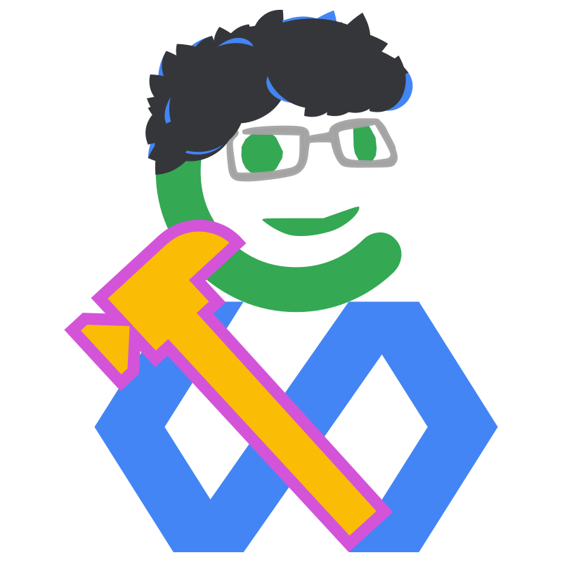
Oh and for fun, here's a hybrid of Gus' GoSimple profile image (aka the GoSuraj logo but including his trusty hofkit hammer from Gus-O-Tron) blended with Characterful Design:
Gus (Characterful Hybrid)
That's all from me for now - Chloe.